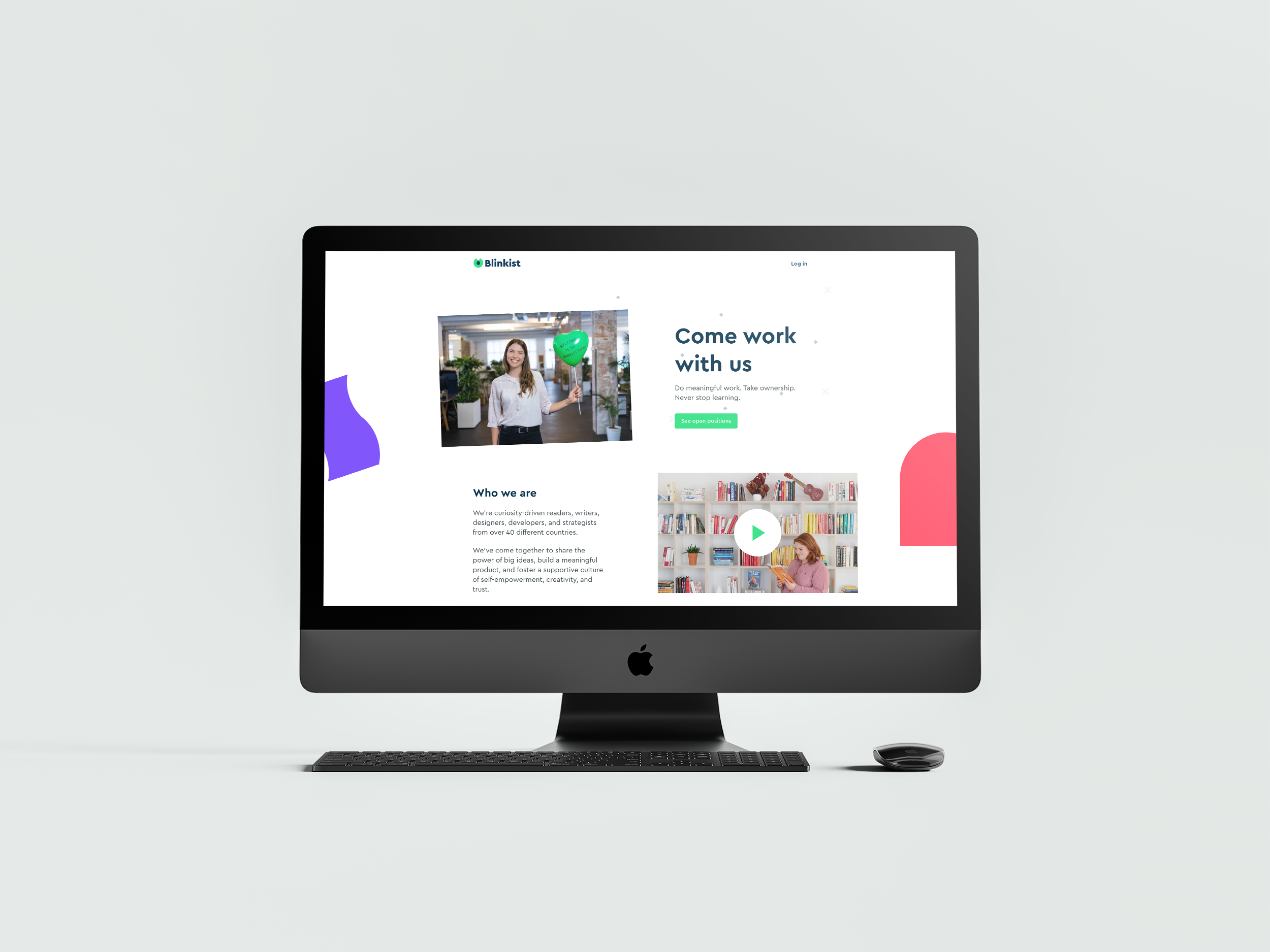
As lead designer on this project, I worked and coordinated closely with stakeholders to redesign the Blinkist careers page that could attract job applicants to apply for our job openings. I was responsible for the research, wire-framing, and creation of pixel-perfect mockups. The result of this project was that the new Blinkist careers page performs way better than before.

The Challenge
Blinkist has a great Glassdoor score but the current careers page doesn’t fully represent how good the company is — it’s text-heavy, not visual, and not very inspirational. Candidates might decide not to apply because they didn’t find the right information.
The Goal
Create a new careers page that aligns with our culture and brand. We want to attract more website visitors to our jobs page and visually convey how Blinkist is a great place to work.
Design Process
To kick off this project, I wanted to find out what visitors cared about the most when they landed on the career page. Therefore, I conducted light user research. Based on the result, I discovered that we could classify users into two distinct groups.
Young Professional
They have no valuable work experience or passion for Blinkist. They heard that Blinkist is a cool product and want to work there to learn more.
Senior Professional
Usually, already love the company, have a passion for self-growth, and want to work in a fun, trustable place. Salary is essential but not the top priority.
To satisfy both groups, my hypothesis would be that if we focus on Product / Vision / Culture / Team / Benefits / Openings this structure would result in a higher percentage of visitors applying for jobs.
I created a wireframe of the page with some copy and photos that I used as placeholders to effectively communicate the ideas. I shared it with the stakeholders to gather feedback and iterate on it.
After we all agreed on the wireframe, I then discussed the copy with our content strategist. The video team also started to prepare for the photoshoot and video filming. After all the materials were ready, I then finalized the design, created the mobile layout, and implemented it with the developer.
Design Details
- I use camera instead of jobs to give people a feeling that they could develop their career at Blinkist.
- Showing the job openings right at the beginning because, according to my research, some young professionals usually like the product and want to see if there are jobs available that match their skills and experience.
- According to my research, people who often know to see if they are interested in what the company is doing and, also to see if it's a progressive company. By using a clear paragraph to give the visitor an idea about Blinkist's history, product, and mission (future).
- According to my research, a lot of visitors want to make sure the company is a fun place to work. I included this section to make it look fun, sociable, and collaborative.
- Showing the company core values to give the visitor a sense of Blinkist's company culture.
- Showing the additional benefits to demonstrate that Blinkist wishes their employees.
- Clearly listing the open positions, grouped by function, to allow visitors to quickly find the ones that are appropriate to them.

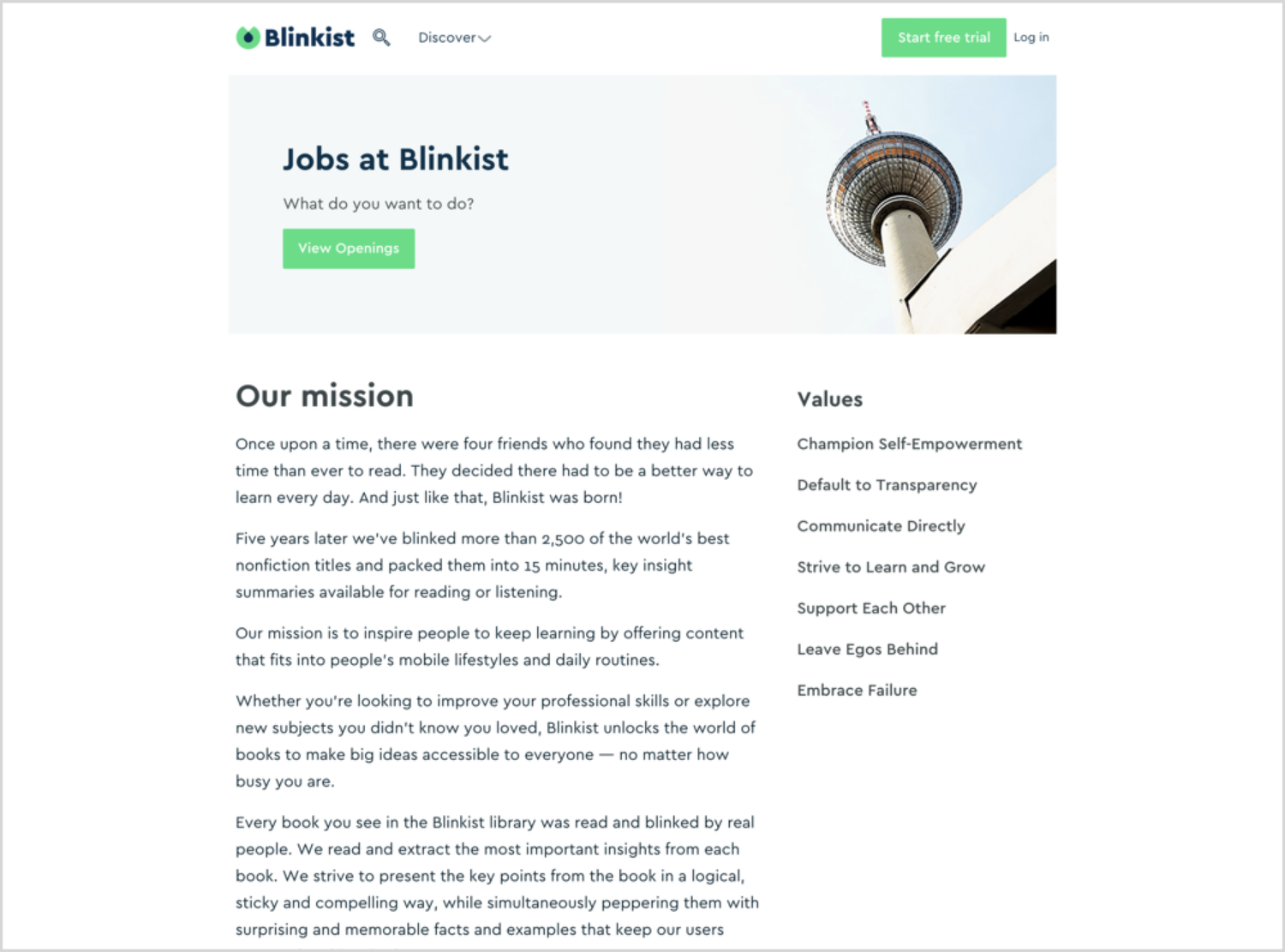
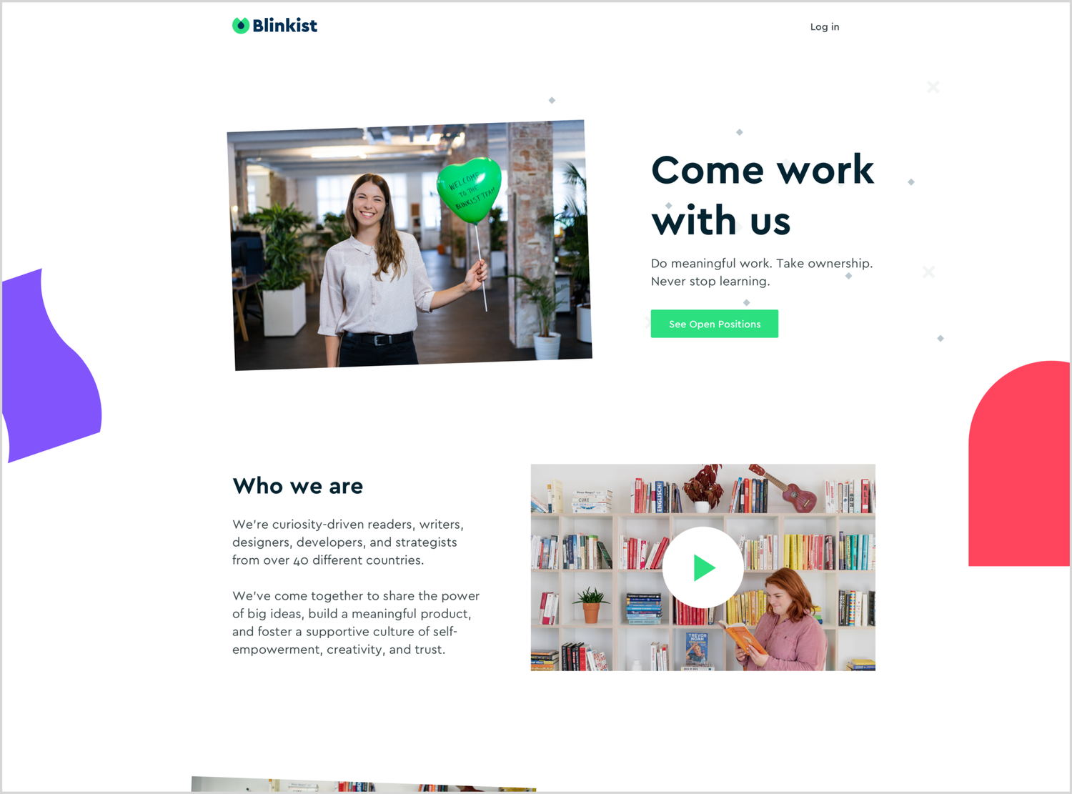
Before & After


Outcome
We received a lot of positive feedback from users. The new careers page design is much more aligned with the Blinkist brand idea makes potential candidates curious to learn more about Blinkist. The page also boosts the traffic towards Blinkist social media accounts.
Final Thoughts
This project involved many people across many teams. I was very happy to see all teams could work together to create as much great content that ultimately made this page as interesting and appealing. I was also proud of the initial inspirational placeholders I provided, served as a great reference for the team, helping them understand my design vision.
Thank you for reading.