As a lead designer on this project, I worked and coordinated closely with stakeholders to redesign the Blinkist web player that could increase the usage of our premium users. I was responsible for the research, wire-framing, and creation of pixel-perfect mockups.
Problem
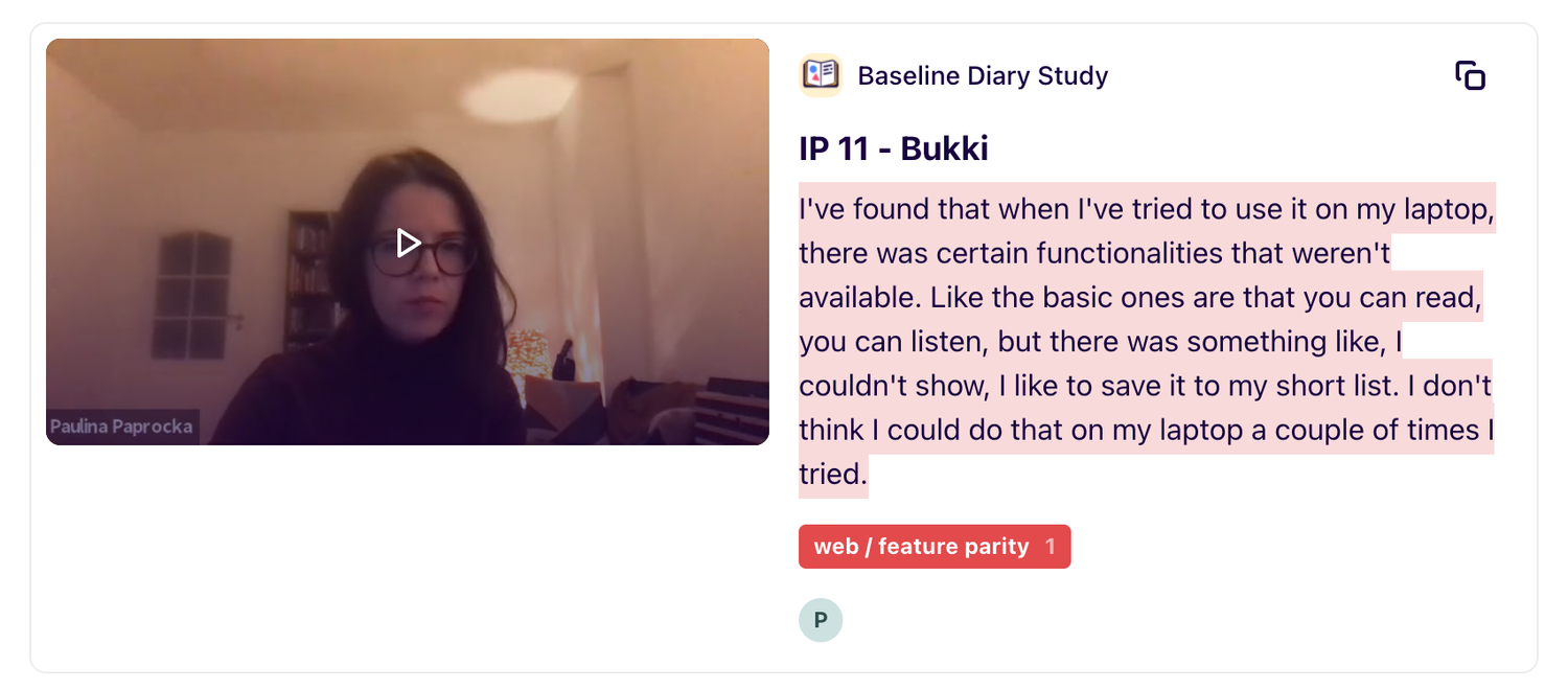
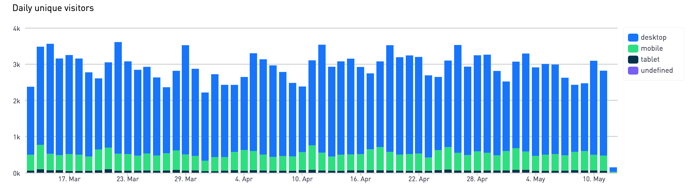
- More and more researches show that our users have a need of using the Blinkist web application.
- Data also shows that in India, a significant amount of the Blinkist premium users are using the Blinkist web app, our hypothesis was that they use it for learning English.
- Our web app hasn't changed since 2014, compare to our mobile app. It lacks lots of basic functionalities which cause a bad user experience for our premium users.
Goal
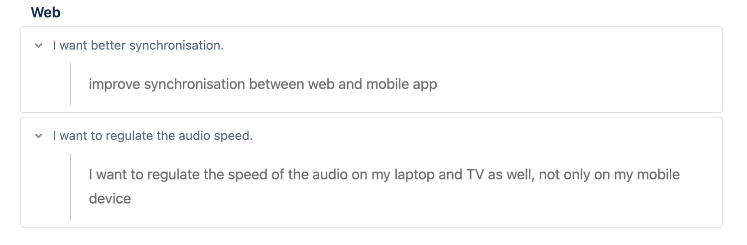
- Make the Blinkist web app to reach the basic parity with the Blinkist mobile app.
- Reduce the micro frustrations by fixing the existing UI issues.
- Modernize the look and feel by applying our up-to-date design language.
My Role
The project was about 3 months. I was the lead designer of this project. I was responsible for the end-to-end user development process in the web growth mission team to ensure we deliver a good UI/UX on the web, and also aim to keep PM to drive the process.
Our team includes
- One Designer (me) / One Web Engineer / One PM to with support five more writers
My scope includes
- Understand users pain points and grab inspires from quantitative and quantitative data
- Collaborate with web engineers, to understand the tech constraints
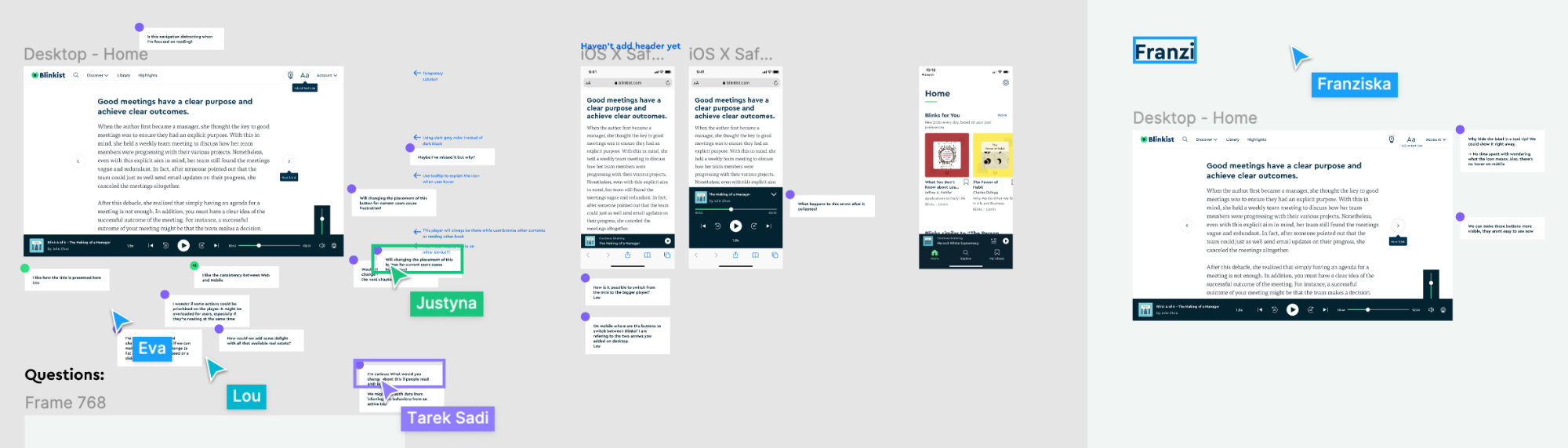
- Run user tests to scaled user needs
- Design and deliver UI/UX designs
Design Process
Research & Data findings
- More users use the "Highlight" feature on the Blinkist web app during the survey, many users used it most to keep highlights on the end.
- Both iPad and Himeji people use the old-school web app to find thesmth Russian.
- Survey shows more recent users use the web to “listen to” vv read. Many lean toward “listen”. It has feeling access to use depending on what’s one is most surprised to use.
Priorities
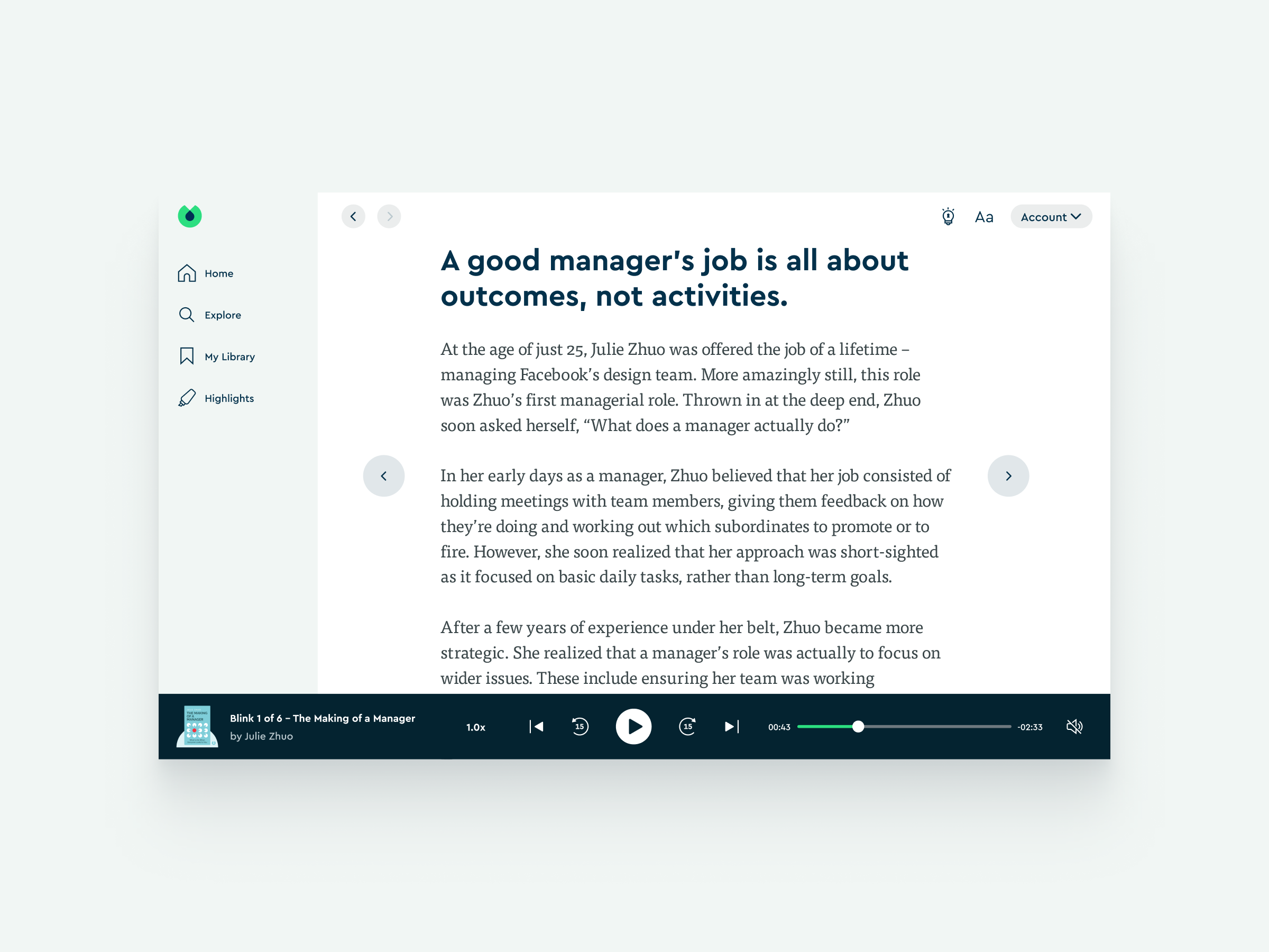
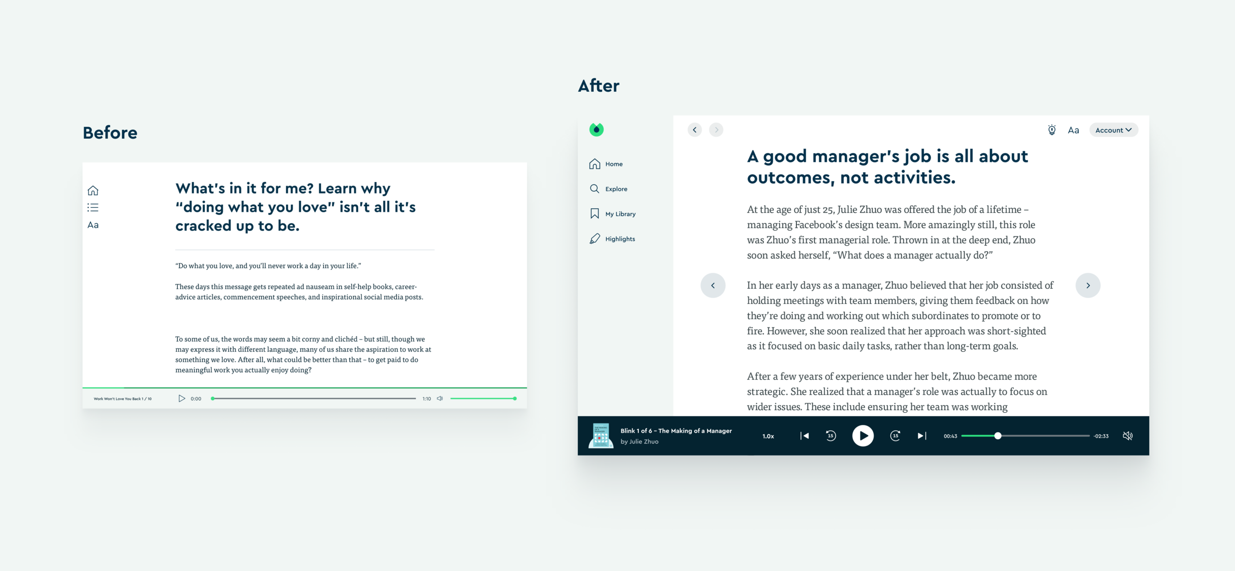
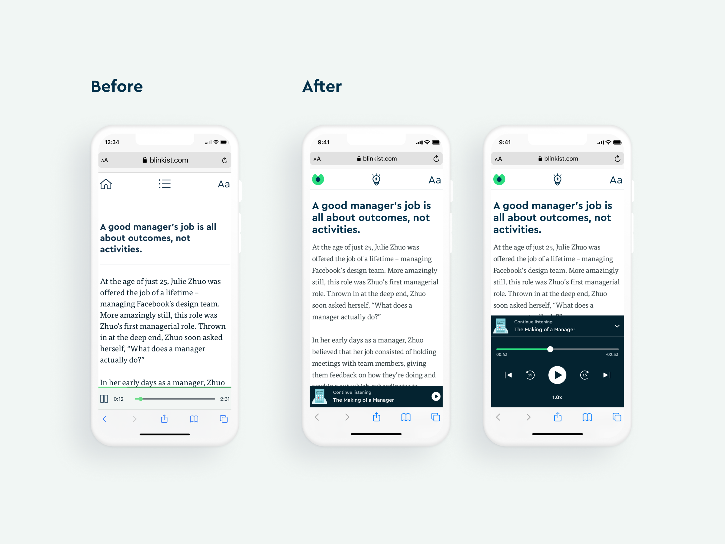
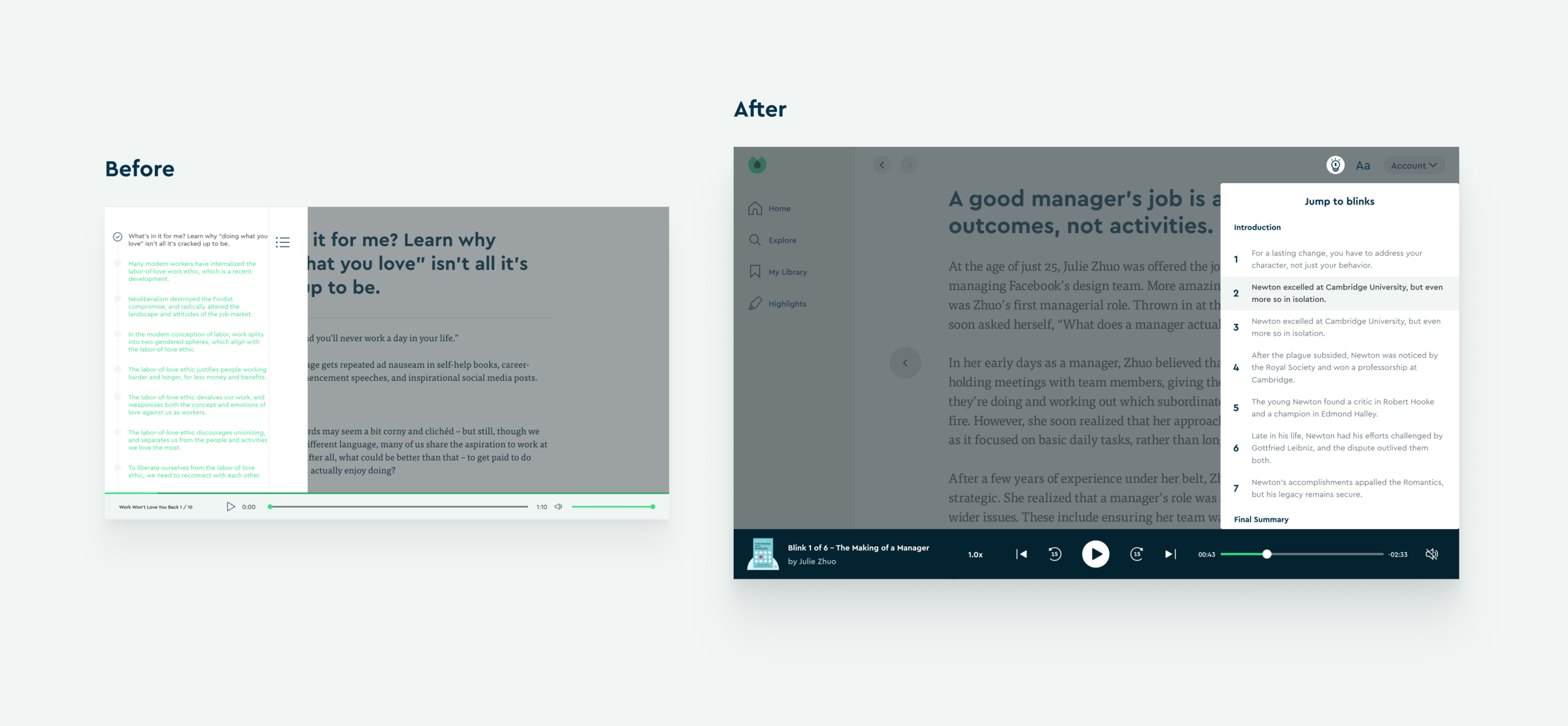
For web development, we started from the Reader/Player section.
Design Solutions
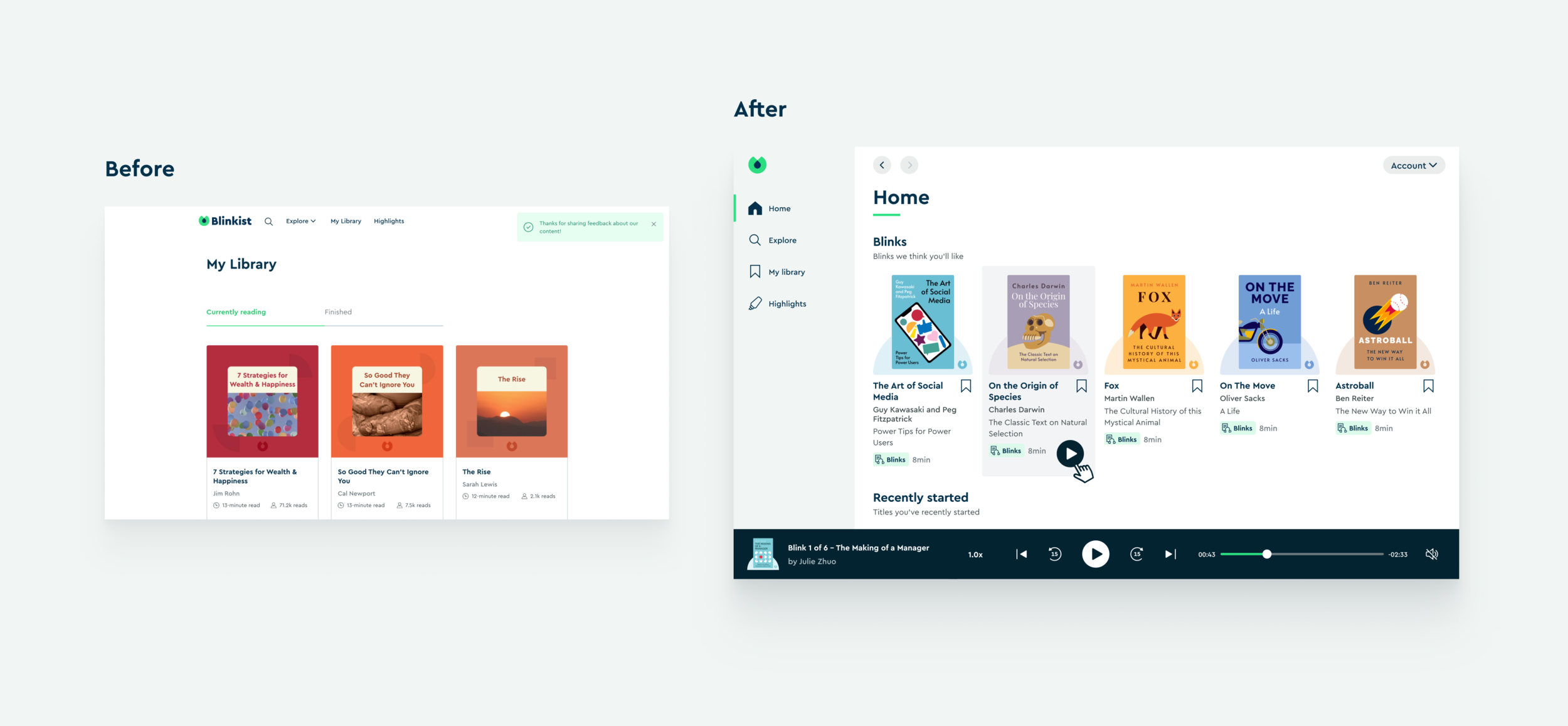
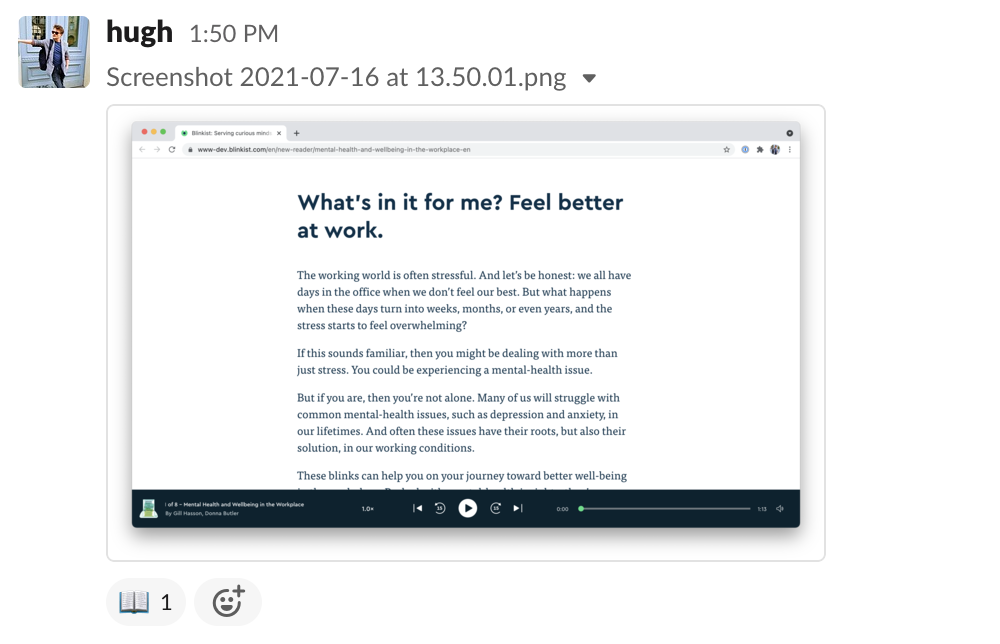
1. Web Reader/Player
2. Key Ideas Section
3. Home Section
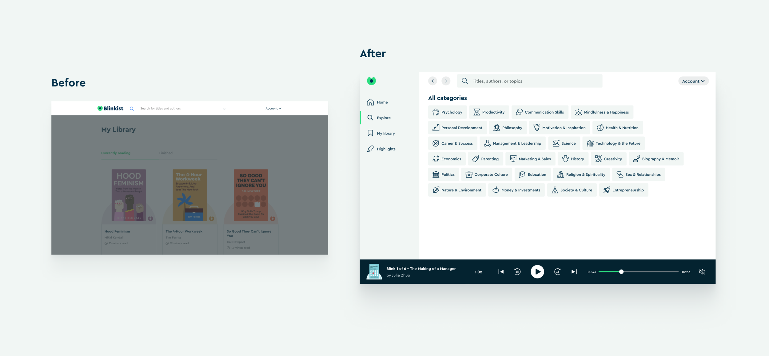
4. Explore Section
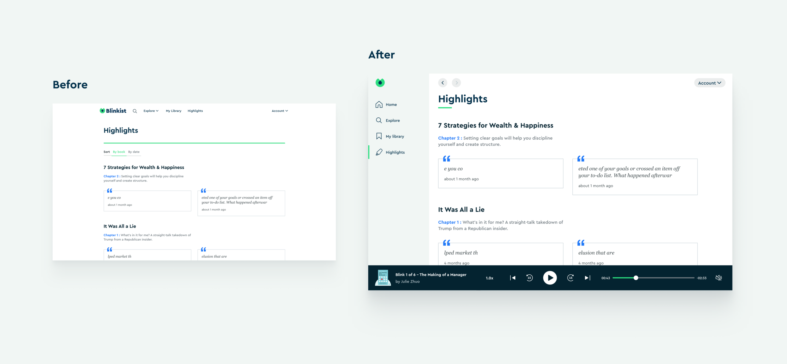
5. Highlights Section
Project Status
Due to some priorities switch, this project is moving forward slowly. Therefore, it’s not live in the production yet. However, I am still very happy that the books is very excited about this project.
Thank you for reading.