As a lead designer on this project, I worked and coordinated closely with stakeholders to redesign the Blinkist book page that could attract more visitors to sign up for our product. I was responsible for the research, wire-framing, and creation of pixel-perfect mockups. The result of this project was that we saw an amazing 70.9% uplift in the sign-up rate.
Problem
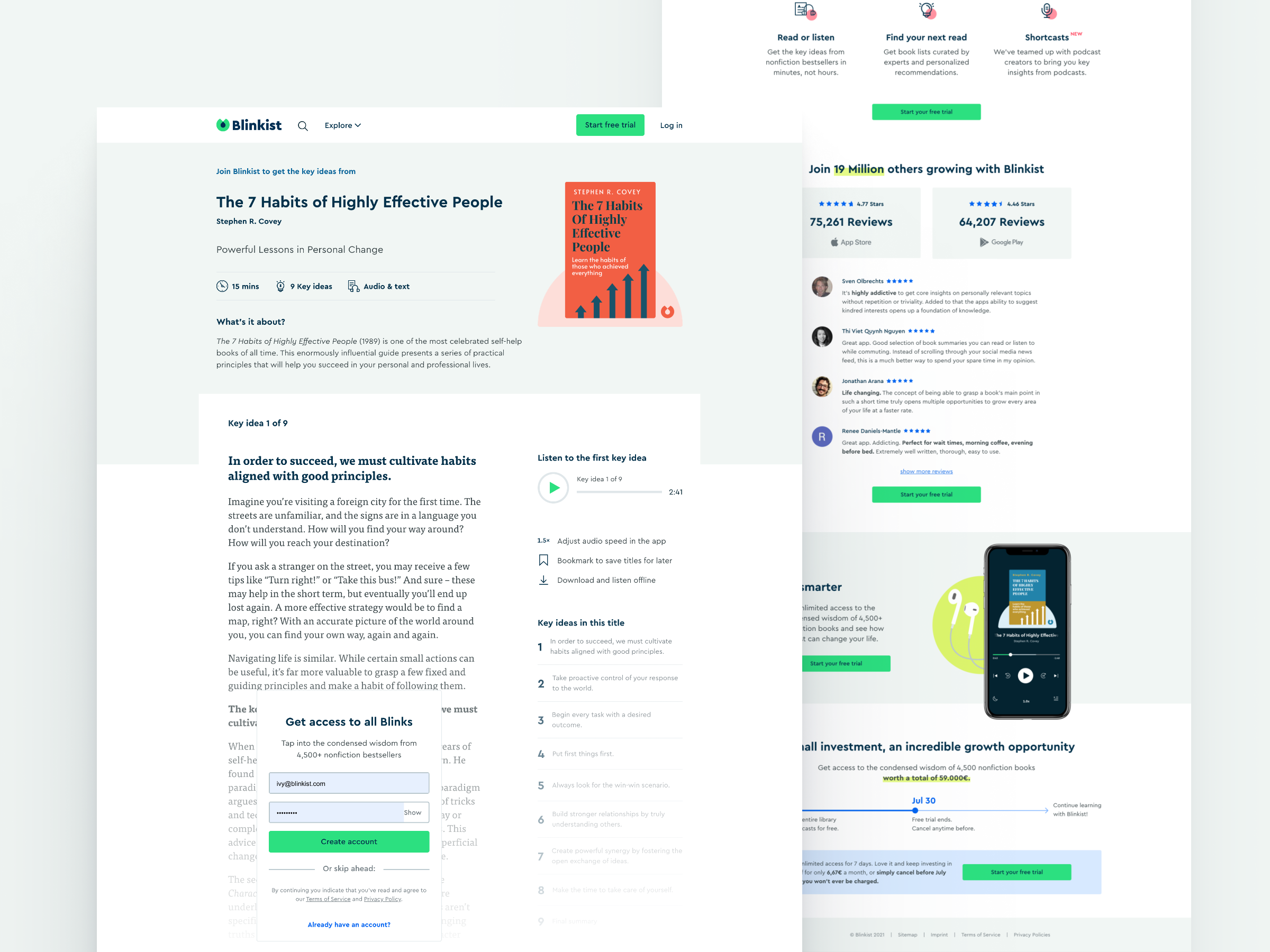
Visitors who land on the Blinkist book page are confused what are the benefits of signing up with Blinkist.
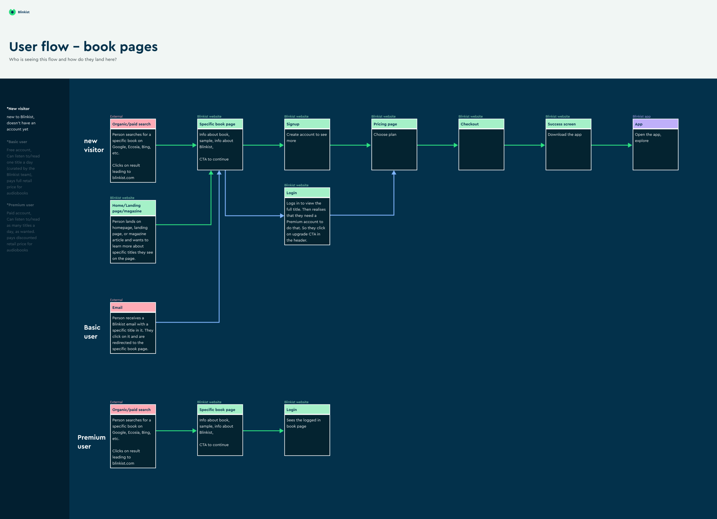
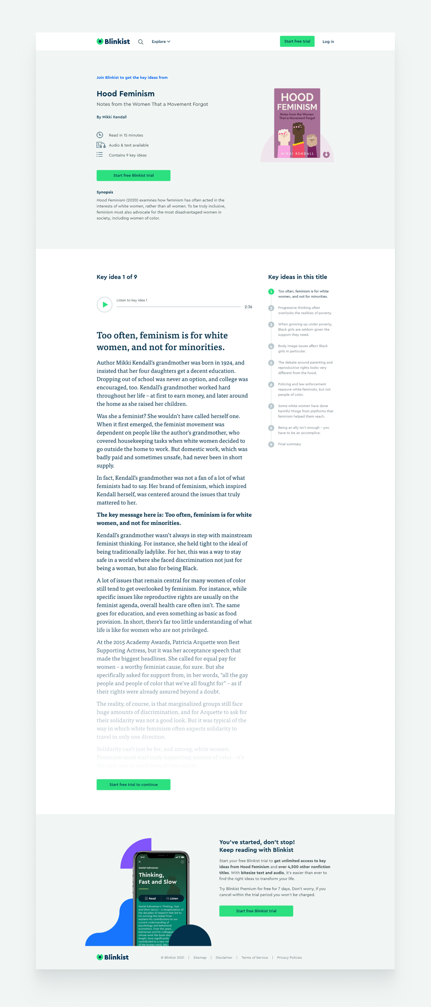
The book page returns a ranking page for blinks (including various information), like the ranking, blog, shoes, etc. For /title/xxxxx/Hating-Effective-People/ the current book page was designed about 3 years ago after the results of the blinks. We’re not ranked several user tests in the past and we know the current book page is missing the benefit of Blinkist and the reasons for subscribing, also, everybody does not have a good understanding of how the trial works.
Goal
Increase the sign-up rates by 10% through a better book page design.
The goal was to help visitors understand what Blinkist is and what value Blinkist can provide. However, definition is to see more people will log in to sign up for Blinkist, and more people make purchases.
My Role
The project was about 2.5 months. I was responsible for the end-to-end web development process in the web growth mission team. Not only did I help to uncover potential user problems and deliver designs, but also acted as a PM to drive the team.
Our team includes
- One Designer (me) / One Content Strategist / Two Web Engineers / One QA
My scope includes
- Understand users pain point and find insights from qualitative and quantitative data
- Collaborate with content strategist to ensure we have compelling copy
- Form the hypothesis that brings values around users
- Design and deliver UI/UX designs
Key Design Outcomes
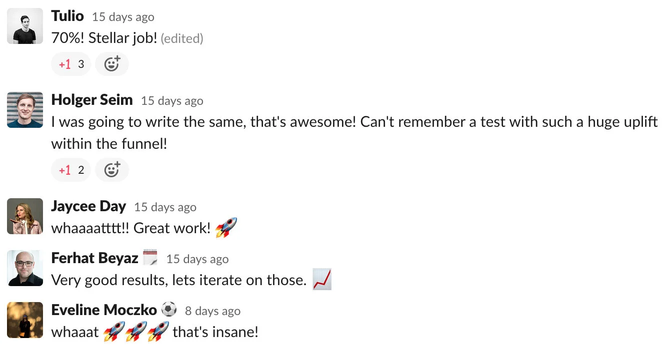
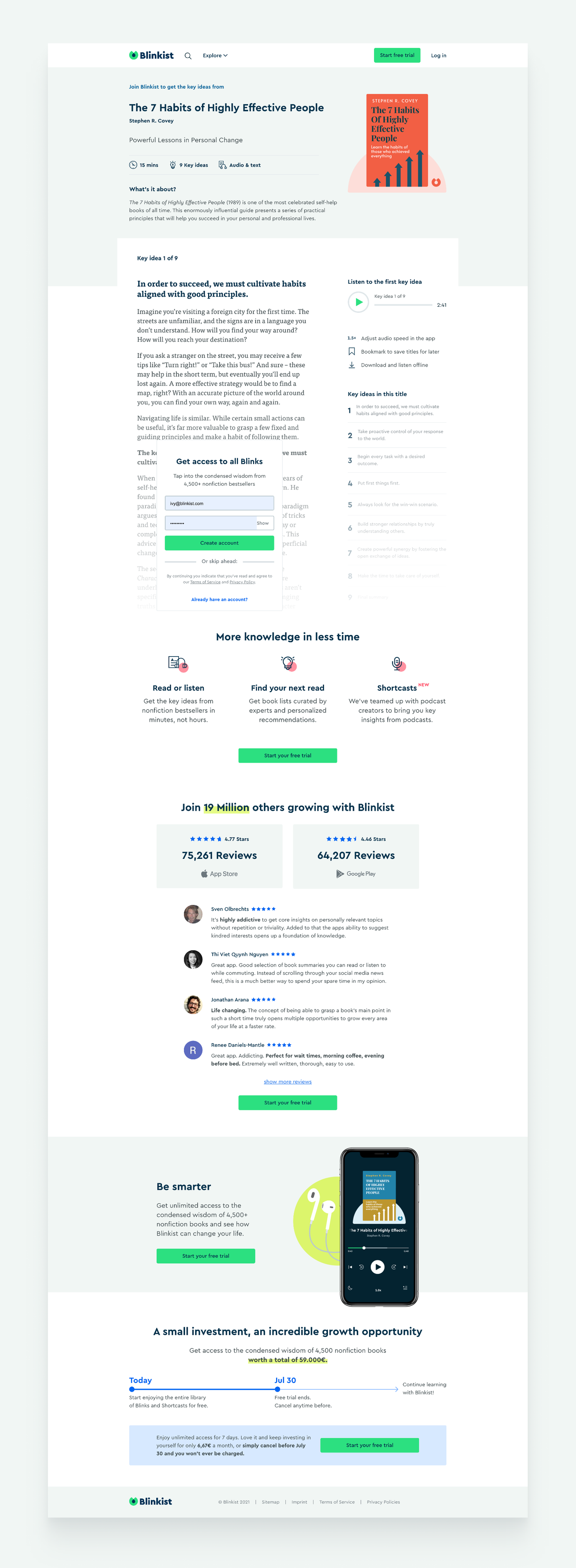
In total, we tested 3 variations — Control, with and without pricing information. The one with pricing variation resulted in an amazing 70.9% uplift in the sign-up rate. Therefore, we rolled out the new book page showing the pricing.

Learnings
We were surprised about it. Initially, we thought by showing the price as early in the funnel might hurt the conversion. It turns out users like to see that we are transparent about the pricing.
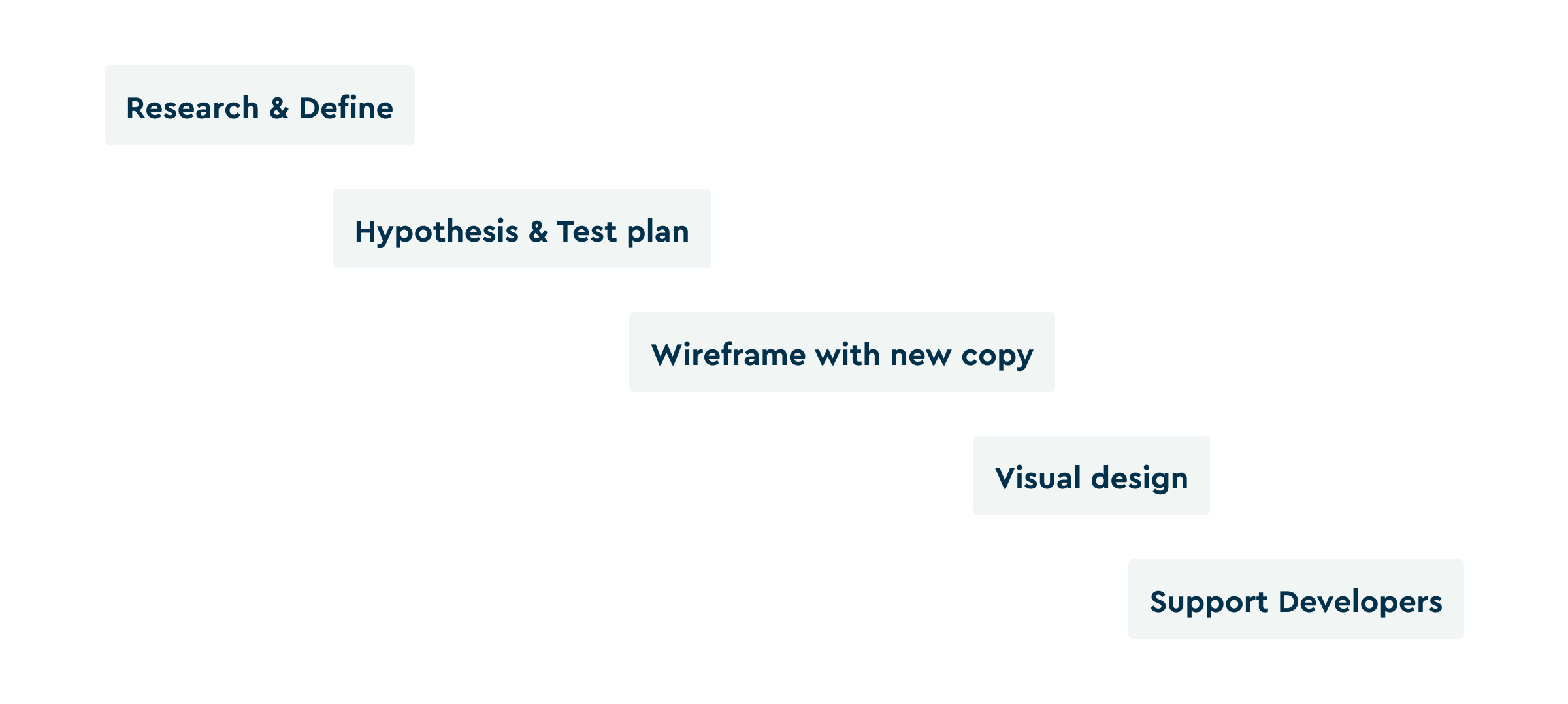
Design process
The problem we want to address
- Missing the benefits of Blinkist and the reasons for subscribing.
- Everybody does not have a good understanding of how the trial works.
The hypothesis that might solve the problem
- Add compelling copy: 4000 readers of the online library
- Add emotional triggers
- Add total app store ratings and reviews examples
- Highlight Blinkist key features (audio speed, download/offline, bookmarking)
- Add single page cta with Google etc.
- Make the sample content greenish cues shorter to reduce potential distractions
- Condensed footer — less distractions
- Explain how the trial works
Test Plan
We decided to have two variations, with and without pricing information.
Majority, this means the book page more compelling such that we can list the book titles on the homepage to the book page.
Before & After
Thank you for reading.